
Timeline
8 Weeks
Role
Project Manager, User Research, Product Design
Team
3 Project Managers, 4 Product Designers
Tools
Figma
00 Overview
What is Campus Health and Wellbeing?
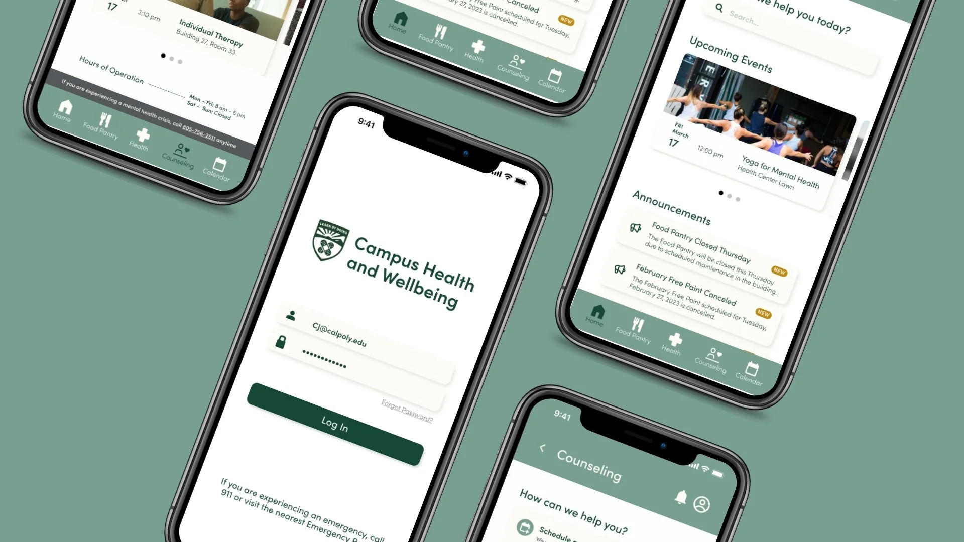
Campus Health and Wellbeing offers basic needs, counseling, and medical services to Cal Poly San Luis Obispo students through the on-campus Health Center. Our team at Cal Poly Iter8 (Cal Poly’s first product design lab 🎉) designed a mobile app to increase awareness and improve access to these resources.
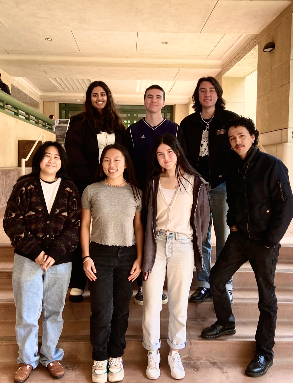
Say hi to the HealthE Team 👋
Pictured left to right:
Mahati Subramanium Graphic Communication, UX/UI | Packaging
James Irwin Computer Science
Andrew Doud Computer Science | Psychology
Anais Gomez (PM) Graphic Communication, UX/UI
Jessica Mason (PM) Liberal Arts Engineering Studies
Kylie Wong (PM) Graphic Communication, UX/UI
Alex Woon Graphic Communication, Design Reproduction Technology | Spanish | Studio Art
01 The Problem
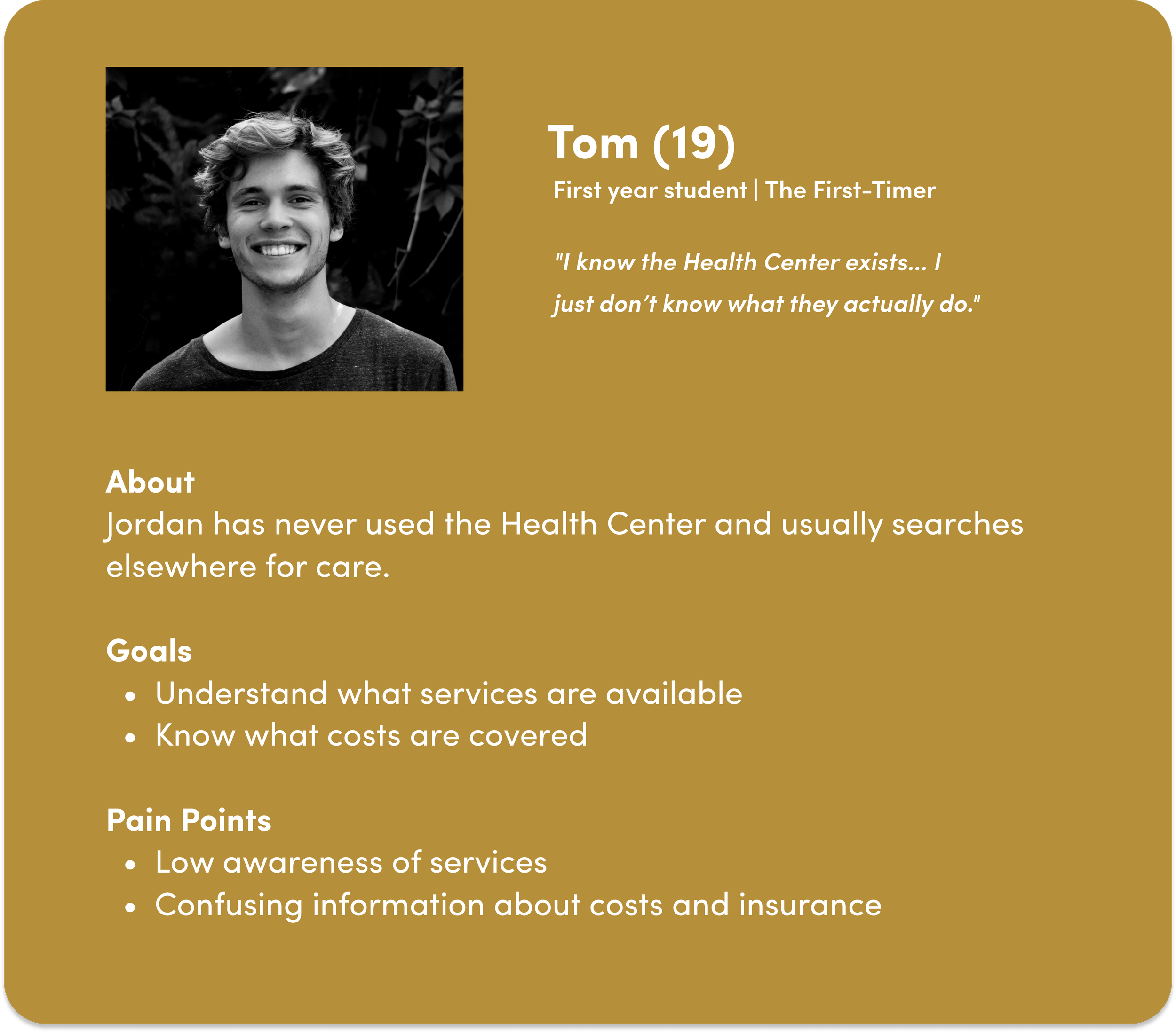
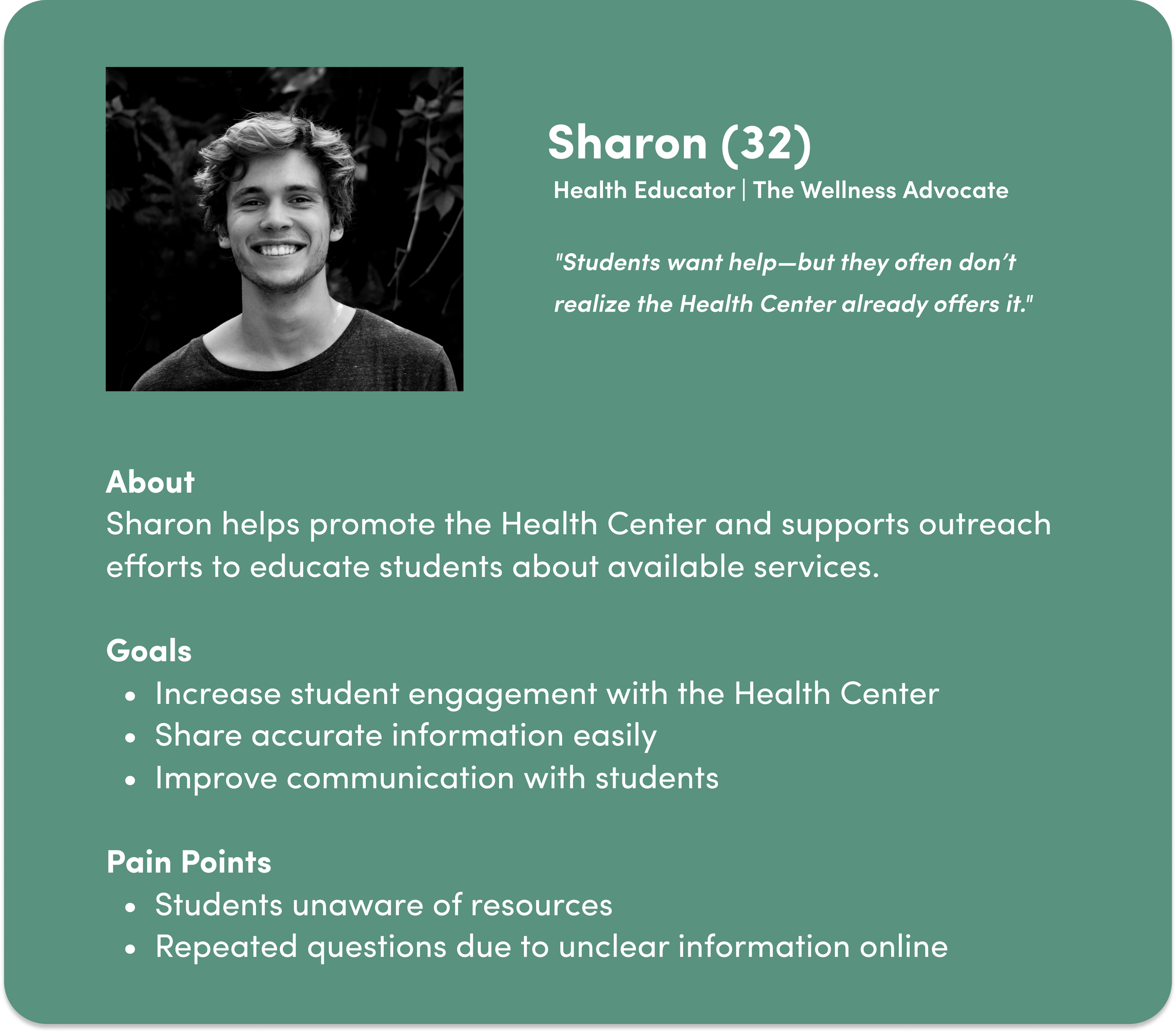
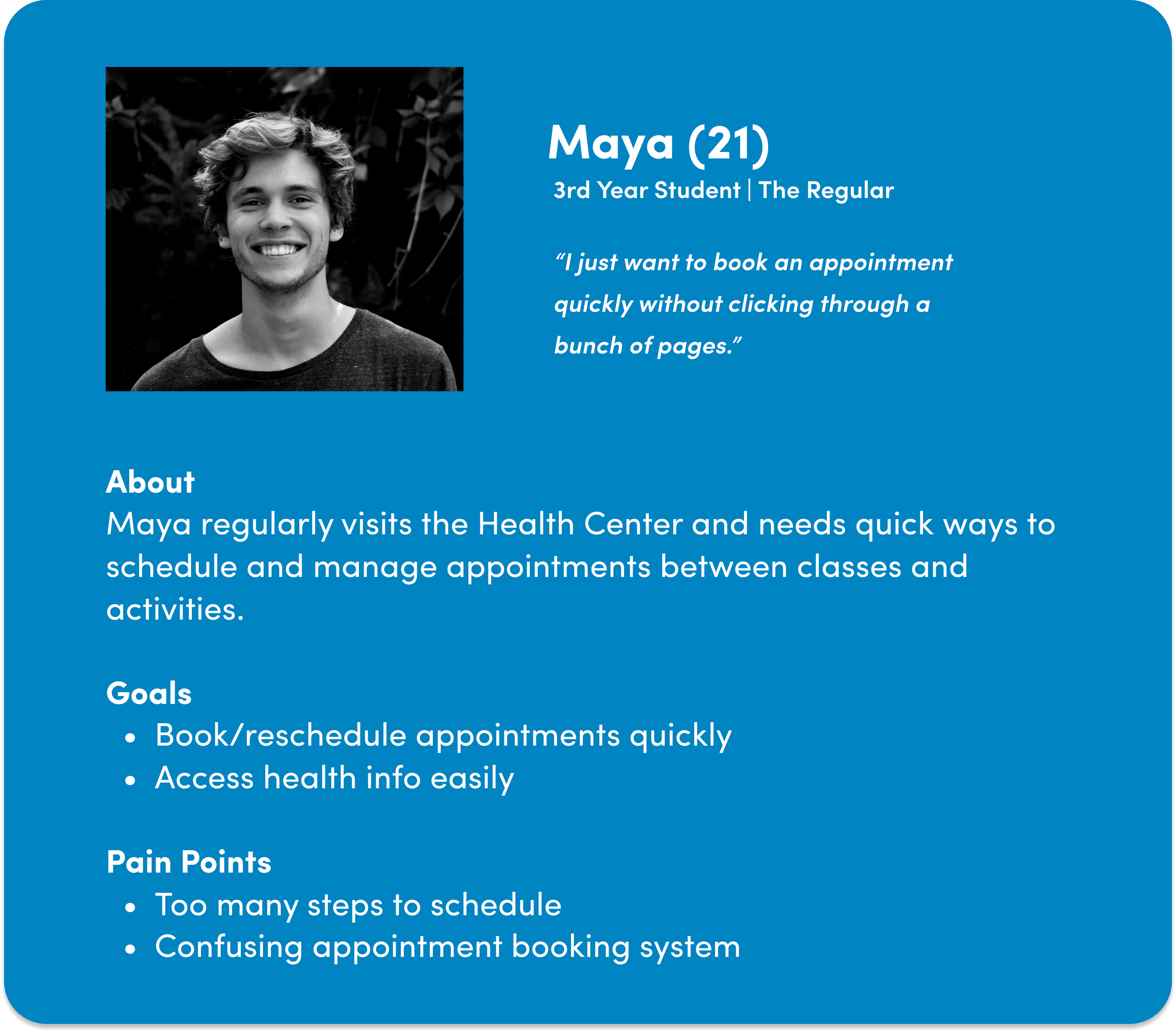
To understand user pain points and the existing experience, we conducted research across three groups: regular Health Center users, non-users, and Health Center student leaders and staff.
Pain Point #1
Creating appointments is challenging.
Students can only schedule appointments in person or over the phone, and usually can’t schedule in advance.
Pain Point #2
It is difficult to find mental health resources.
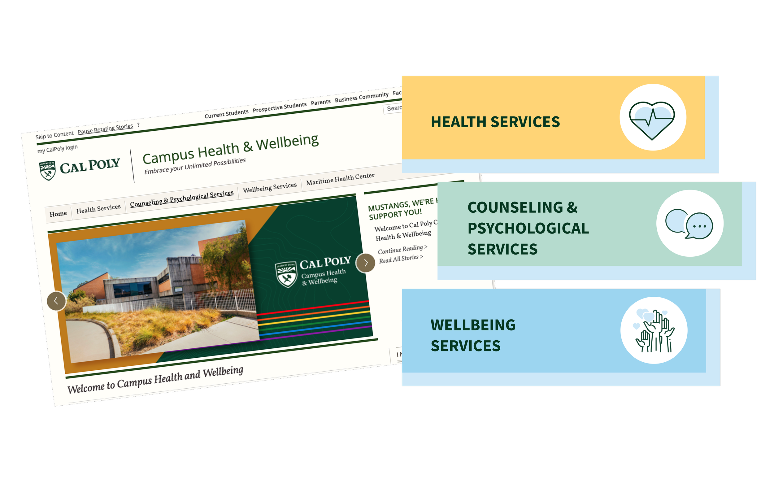
The information on the Health Center website is very disorganized.
Pain Point #3
Students want a fast, convenient way to check food pantry availability, a free service that provides food to students in need. Currently, students visit the pantry physically to check the inventory, where they are sometimes out of luck.
02 Research and Insights
Competitor Analysis
After completing these user interviews, we conducted lightning demos where we compared the Cal Poly Health Center and Wellbeing website to those of other college universities. We created SWOT analyses to assess what works and what doesn’t, and how we could implement successful features into our prototype.


03 Design Exploration
Solution Sketches
Now that our competitor analysis has been completed, we transitioned into Crazy 8's. Each group member created their own Crazy 8 and brought them to our next meeting to discuss our solutions. At the end of the meeting, we selected our top solutions. The sketches below represent the final sketches that were chosen.

Mapping Our User Flow
Based on our solution sketches and background research, we created a user flow outlining the onboarding process to the log-out process of the application. Together, we mapped out the user flow for the Food Pantry, the Health and Pharmacy, and Counseling Services. One person was assigned as the scribe of the group while everyone else discussed the flow aloud. We left post-its highlighting questions, concerns, or features we wanted to revisit later.

Ideation
After completing our research, each member developed their solution sketches, touching on various pain points and ideas highlighted in previous meetings. We later shared our ideas and findings as a group, critiqued each sketch, and voted on our top three solution sketches.
Some key design solutions we honed in on were:
A page with up-to-date information on what is available in the Food Pantry
A streamlined appointment booking process
A calendar system containing events hosted by the Health Center


Prototyping
With our user flow in mind, we transitioned to prototyping the low-fidelity and mid-fidelity wireframes using Figma. In all, we created:
A live catalog of what is available in the Food Pantry.
A customizable calendar system showing each Health Center event.
A health appointment booking system for users to schedule an appointment with a doctor on campus.
An ordering system for over-the-counter and prescription medication.
A notification section for users to receive updates about appointments, events, and important information.
Low Fidelity Wireframes

Usability Testing
After completing our prototype, we designated two user-testing groups. One group of users was given specific tasks to complete. The other group of users was given no task and was asked to roam the app freely.
Through this process, we learned that:
A clear button to return to the previous page is crucial.
Links need to be clearer and act as a call to action.
Consistent spacing and alignment are visually important
After gathering these insights, we implemented change by:
Defining active buttons with a gold color and allowing a larger surface area for clicking
Ensured that all spacing was accurate (time-consuming, but important!)
Tidied our prototype paths to ensure that there were no dead ends and a user could accomplish their tasks and explore the app
04 Final Solution
Design System
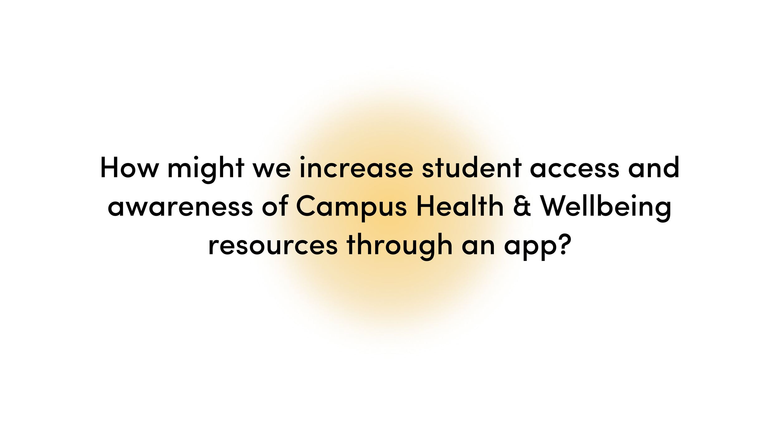
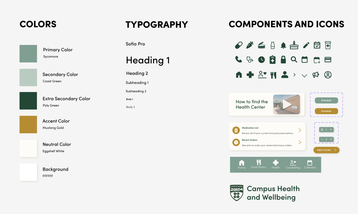
In our high-fidelity prototype, we developed a design system driven by our individual research and user interview feedback.
We chose:
Calming and welcoming colors that still convey themes of official Cal Poly branding
A friendly sans-serif font that increases readability
An original logo to represent the refreshed mobile identity of the Health Center
The Cal Poly Campus Health and Wellbeing Mobile App
After locking in our design system and completing user testing, we arrived at a prototype that we are happy with!
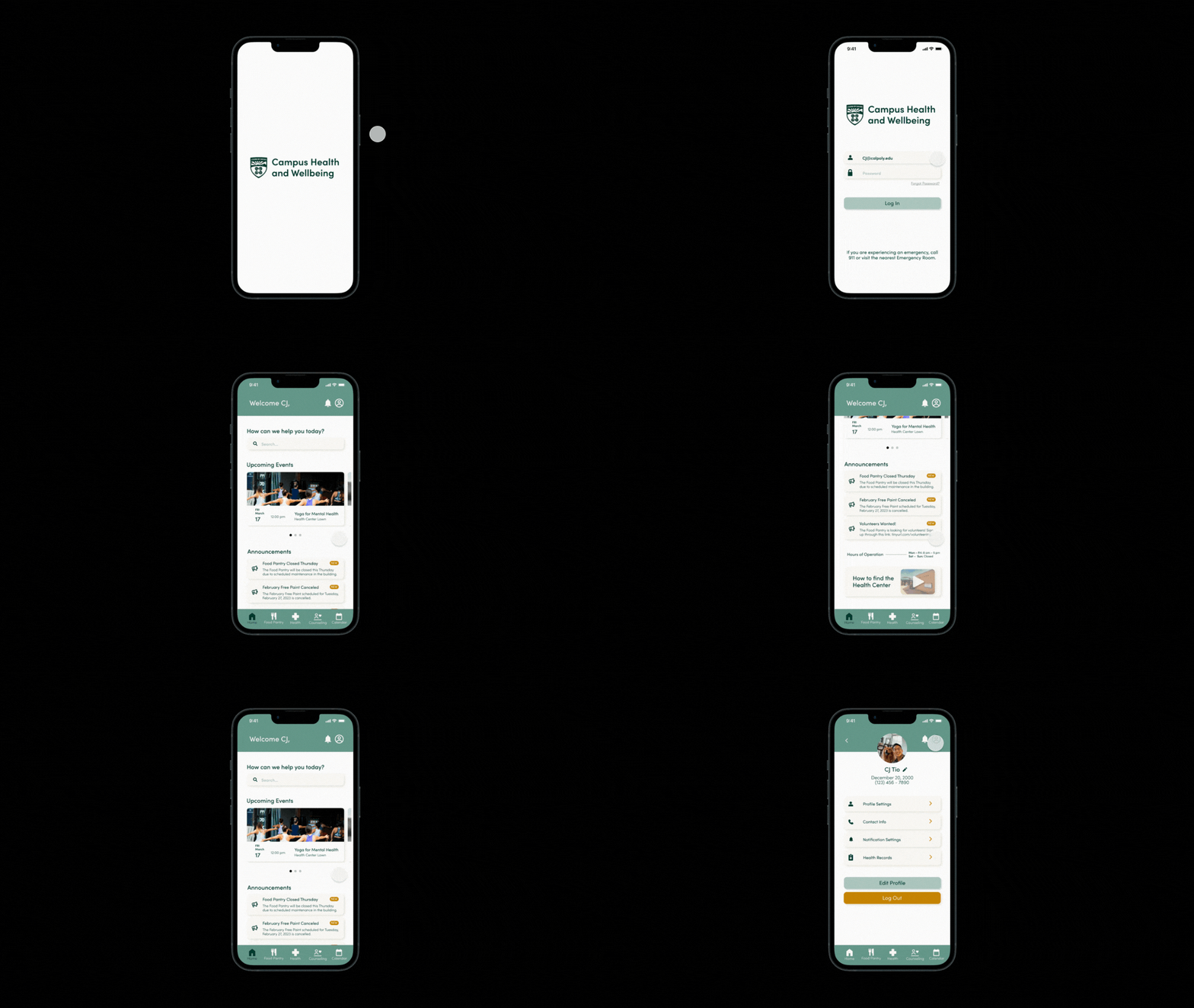
An Intuitive Homescreen
We incorporated a search bar for easy navigation of our app and included upcoming event notices and announcements.
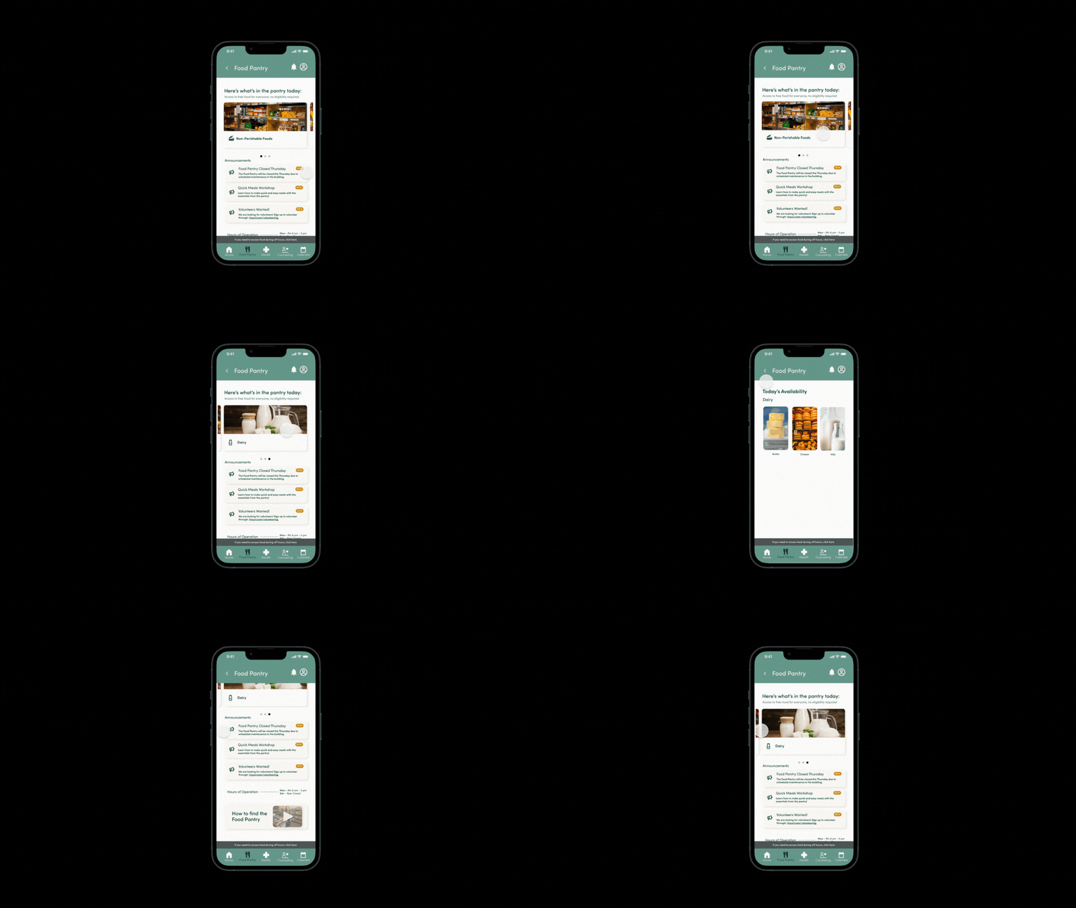
Tracking food at the food pantry
Daily inventory is featured in the top carousel for easy access. Below are important announcements such as closures for the week and volunteer opportunities.
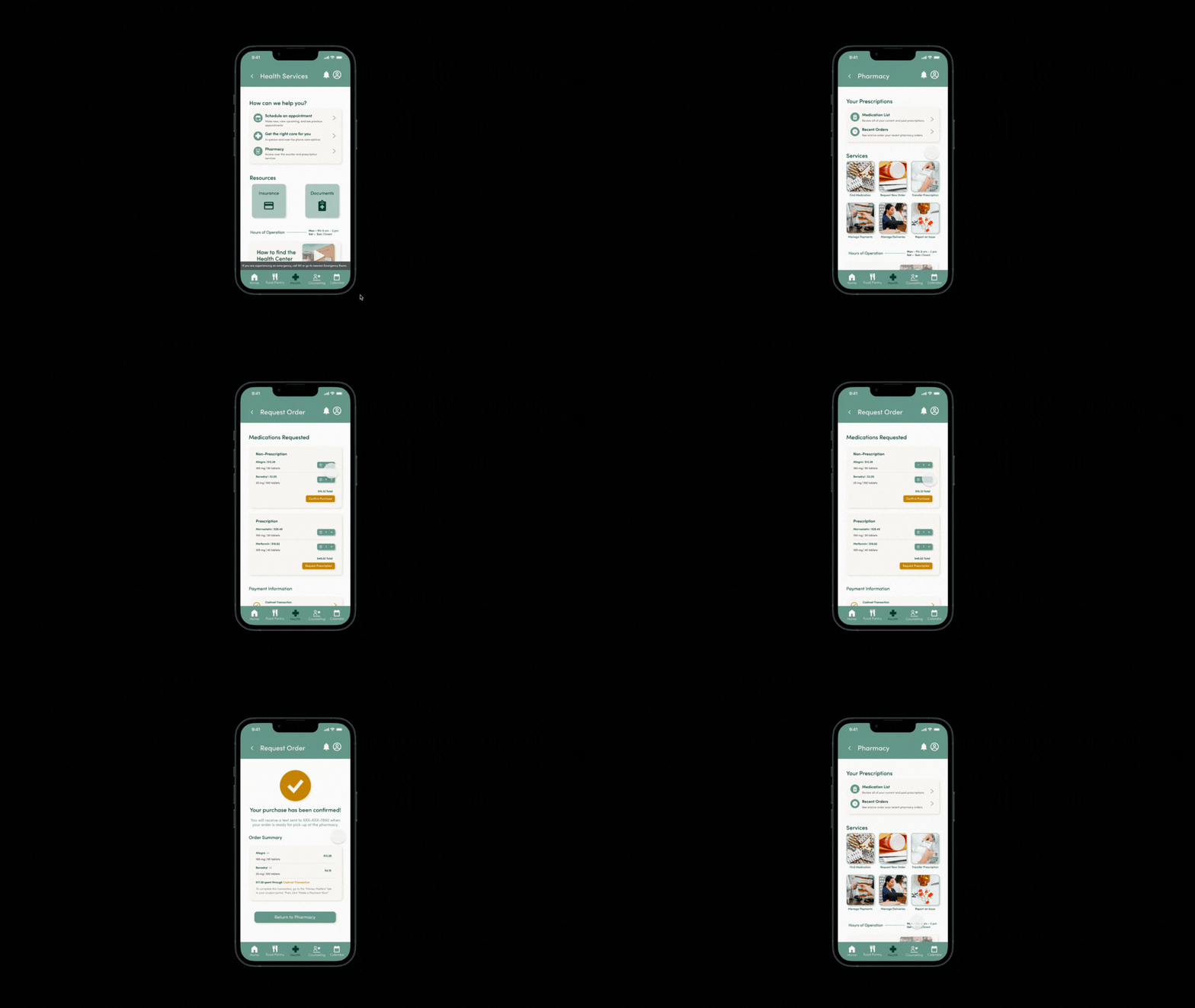
More accessible health services
Appointment scheduling and prescription preorders are designed to be easier to complete on the app.
05 Challenges and Lessons Learned
Throughout the quarter our student designers met twice a week — syncing our schedules required planning ahead and setting designated meeting times. During the first few weeks of our project, we met in the Graphic Arts building and the Library, but we needed a central location to allow our team to get into the iterating headspace. To establish this space, our team applied to the Hatchery, an interdisciplinary playground through Cal Poly Center for Innovation and Entrepreneurship. With this connection, our team was able to grow our roots in this creative space.
06 Next Steps
Currently, Cal Poly Health and Wellbeing is undergoing a redesign of its website. Moving forward, we may meet with the team responsible for the web development at the Health Center and gain insight into their goals, while suggesting our prototype and research from our case study.
See our prototype in action 👀